Why Approach to Dark Mode on Your Website?
It’s been taking the Internet by storm for ages now, and users never tire of requesting it. Well, Google’s finally answered their prayers by announcing the Android Q that would officially come with its own true Dark Theme at Google I/O (2019).
The new Dark Theme for Android Q works pretty smoothly: a simple toggle from the Quick Settings menu on your device, and voila! Everything changes from boring, old white to uber-cool black.
A lot of the said benefits of having the Dark Theme include optimized battery life, reduced stress on the eyes, and better comprehension. If not anything else, the dark mode looks far cooler than anything we’ve seen before.
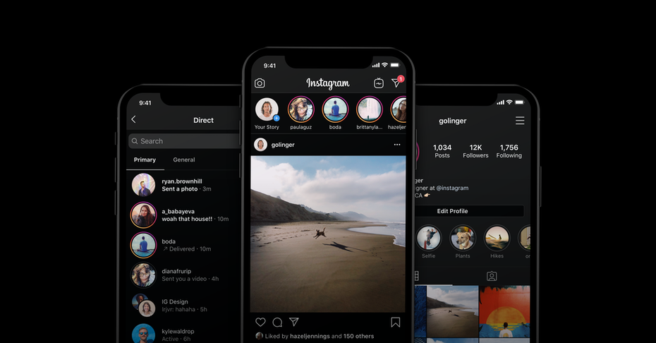
Dark themes across websites and applications grew wildly popular after Google launched a dark mode for pretty much everything, from Gmail to Google Drive to YouTube. In fact, in the past few years, two of the biggest tech giants, Google and Apple, have adopted dark mode as an integral part of their User Interface across all platforms.

So, the big question is: why use dark mode in web design in the first place?
Some Evidence
Take a stroll through your neighborhood any day, and you’d find almost everyone with their necks bent, staring intently at a picture, video, or typing in a text in their phones. More and more people are using their mobile devices these days, and it’s no wonder.
After all, you can now use a phone to do almost anything you like – book tickets to your favorite movie, book a table at a restaurant, order food, in short: everything. This is where dark mode in web design comes to the fore.
Saves Energy
A recent test conducted by PhoneBuff concluded how you could optimize your iPhone battery by upto 30 percent if you used dark mode. As everyone seems to believe, a dark theme UI is great for your phone’s shelf life, and more so if it has an OLED screen. The black pixels draw almost no power and can help decrease battery usage to a large extent.
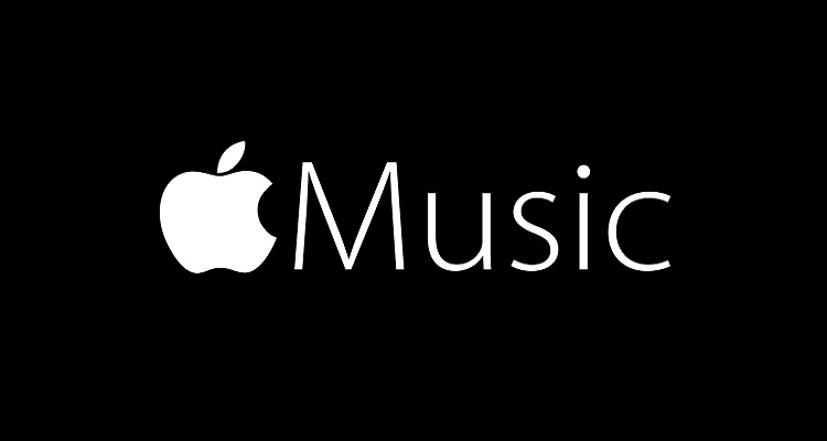
More Emphasis on Visuals
If you check out applications such as the music streaming apps Spotify or Apple, or the show covers on streaming giant Netflix’s website, you’ll notice how the lighter, more colored graphics and images seem to stand out. This is because the darker, more rich background offers this high-contrast backdrop that seems to bring out the color beautifully.

Images, videos, and other graphics assume this strong visual hierarchy that would otherwise be tough to bring out in a lighter background. A dark color palette might be the best choice for those looking to develop a site or application that focuses more on images or videos.
Enhances The Emotional Quotient
Black themed website design often needs more negative space, more emptiness to de-clutter the interface. Therefore, websites and apps with dark UI (User Interface) seem to elicit far stronger emotional responses than light-themed ones.
Darker colors such as black or deep gray are usually associated with feelings of mystery, intrigue, drama, and power. Thus (such as on Netflix), when you pair a dark background with high-quality pictures, you get simply stunning design.
So Should You Make The Switch?
Choosing to go all dark on your website or mobile application isn’t a magic potion that’ll instantly skyrocket your business to success. Before you make the switch, here are a few things to consider:
- Blurriness: One of the most significant drawbacks of implementing dark mode in web design is that it could cause the users’ eyes to blur and sometimes even block out the content. That’s because the darkness forces the pupils to dilate while processing the visuals, which reduces our visual sharpness in the long run.
- Halation: A major cause of concern for those with visual impairments is the process of halation. It causes font and text in lighter colors to wash out in the black background, causing them to blur, causing significant distress to those with myopia and other visual ailments.
So should you shift to dark mode for your website?
As is evident, there are many things to consider. Before you jump onto the dark mode bandwagon, make sure you know your target audience well. If you are looking at a slightly younger demography, then going Dark Theme might be a great idea. Youngsters, after all, often prefer something that looks cool and is suitable for daytime usage.
You can also opt for a switch between light mode and dark mode, as many companies have recently done, such as Reddit or YouTube. That way, you give your users a choice between the two and the ability to make up their minds and choose as and what they like.

While some of your users may prefer dark mode, others may prefer a combination of both at different times of the day. Make sure you give them ample choice, or else you might risk losing customers.
Have doubts about what goes and what doesn’t in your website design? How about you reach out to us? We’ll respond right away and let you know what we think.

One thought on “The Dark Lord: Introducing The Voldemort of Web Design and Development”
Comments are closed.